Understanding Contrast in Color Images: Beyond Luminance
In grayscale images, contrast is relatively straightforward—it’s all about differences in brightness. But when color enters the picture, the story becomes fascinatingly complex. Two colors can have identical luminance yet appear strikingly different. A red button on a green background might be instantly noticeable even if both have the same brightness. This phenomenon reveals a fundamental truth: color contrast is multi-dimensional.
Note: This post builds on concepts from Understanding Contrast in Images: From Perception to Computation, where we explored grayscale contrast metrics like luminance contrast, Michelson contrast, RMS contrast, and local contrast. If you’re new to contrast metrics, I recommend reading that post first.
This post explores how contrast works in color images, diving into chromatic contrast, opponent color channels, perceptual color spaces, and practical applications in computer vision, web design, and image quality assessment.
Table of Contents
- The Multi-Dimensional Nature of Color Contrast
- Luminance Contrast in Color Images
- Chromatic Contrast: The Color Difference Component
- Color Contrast Metrics
- Practical Comparison: Different Color Patterns
- Color Contrast in Different Color Spaces
- Applications in Computer Vision and Design
- Color Contrast for Colorblind Users
- Choosing the Right Color Contrast Metric
- Implementation Tips
- Color Contrast in Different Domains
- Conclusion: Color Contrast Is Multi-Dimensional
- Further Reading
The Multi-Dimensional Nature of Color Contrast
While grayscale images have only one dimension (luminance), color images have at least three:
- Luminance (Brightness): How light or dark a color appears
- Chrominance (Hue & Saturation): The color itself and its vividness
- Spatial Structure: How these properties vary across the image
This means we can have:
- High luminance contrast, low chromatic contrast: Black text on white background
- Low luminance contrast, high chromatic contrast: Red text on green background (isoluminant)
- High contrast in both dimensions: Yellow text on blue background
Understanding these dimensions is crucial for everything from designing accessible user interfaces to developing robust computer vision algorithms.
Luminance Contrast in Color Images
The simplest approach to measuring contrast in color images is to extract the luminance channel and apply grayscale contrast metrics.
Converting RGB to Luminance
The standard conversion follows the ITU-R BT.601 recommendation, which weights RGB channels according to human luminance sensitivity:
\[Y = 0.299R + 0.587G + 0.114B\]Why these specific weights? The human visual system is most sensitive to green light (~555nm), moderately sensitive to red, and least sensitive to blue. This reflects the distribution and spectral sensitivities of cone cells in the retina.
Example: Isoluminant Colors
Consider two colors:
- Red: RGB(255, 0, 0) → Y = 76.5
- Green: RGB(0, 195, 0) → Y = 114.5
Adjusting green to RGB(0, 131, 0) yields Y ≈ 76.9, making them nearly isoluminant (equal brightness). Despite identical luminance, they appear dramatically different due to chromatic contrast.
import numpy as np

def rgb_to_luminance(rgb):
    """Convert RGB to luminance using ITU-R BT.601."""
    return 0.299 * rgb[..., 0] + 0.587 * rgb[..., 1] + 0.114 * rgb[..., 2]

# Example: Red and adjusted green
red = np.array([255, 0, 0])
green_isoluminant = np.array([0, 131, 0])

print(f"Red luminance: {rgb_to_luminance(red):.1f}")
print(f"Green luminance: {rgb_to_luminance(green_isoluminant):.1f}")
Key Insight: Luminance-only metrics completely miss isoluminant color contrast, which is highly salient to human vision.
Chromatic Contrast: The Color Difference Component
Chromatic contrast refers to differences in hue and saturation, independent of brightness. This is where color vision truly differentiates itself from grayscale.
Opponent Color Channels
Human color vision is based on opponent processes discovered by Ewald Hering. The brain encodes color information in three opponent channels:
- Luminance (L): Light vs. Dark
- Red-Green (a): Red vs. Green
- Blue-Yellow (b): Blue vs. Yellow
These align naturally with the CIELAB color space (also called Lab), which is designed to be perceptually uniform.
Lab Color Space
Lab separates color into:
- L*: Lightness (0 = black, 100 = white)
- a*: Red-green axis (negative = green, positive = red)
- b*: Blue-yellow axis (negative = blue, positive = yellow)
Why Lab is powerful for contrast:
- Perceptually uniform: Equal distances in Lab space correspond to equal perceived color differences
- Device-independent: Not tied to a specific display or camera
- Separates luminance from chrominance: Enables independent analysis of brightness and color contrast
Converting RGB to Lab
import cv2
import numpy as np

def rgb_to_lab(rgb_image):
    """Convert RGB image to Lab color space."""
    # OpenCV expects BGR, so convert RGB to BGR first
    bgr = cv2.cvtColor(rgb_image, cv2.COLOR_RGB2BGR)
    lab = cv2.cvtColor(bgr, cv2.COLOR_BGR2Lab)
    return lab

# Normalize Lab to [0, 1] range for computation
def normalize_lab(lab):
    """Normalize Lab to 0-1 range."""
    L = lab[..., 0] / 100.0  # L* is 0-100
    a = (lab[..., 1] + 128) / 255.0  # a* is roughly -128 to 127
    b = (lab[..., 2] + 128) / 255.0  # b* is roughly -128 to 127
    return np.stack([L, a, b], axis=-1)
Color Contrast Metrics
1. Euclidean Distance in Lab Space (ΔE)
The most common measure of color difference is ΔE (Delta E), the Euclidean distance in Lab space:
\[\Delta E_{ab} = \sqrt{(\Delta L^*)^2 + (\Delta a^*)^2 + (\Delta b^*)^2}\]Interpretation:
- ΔE < 1: Differences not perceptible by human eyes
- ΔE = 1-2: Perceptible through close observation
- ΔE = 2-10: Perceptible at a glance
- ΔE > 10: Colors are more different than similar
This forms the basis for WCAG (Web Content Accessibility Guidelines) color contrast requirements.
2. RMS Contrast in Lab Channels
We can extend RMS contrast to each Lab channel independently:
\[C_{RMS}^{Lab} = \sqrt{\left(\frac{\sigma_L}{\mu_L}\right)^2 + \left(\frac{\sigma_a}{\mu_a + 128}\right)^2 + \left(\frac{\sigma_b}{\mu_b + 128}\right)^2}\]This captures both luminance and chromatic variation in a single metric.
3. Chromatic Contrast Ratio
For isoluminant patches, define chromatic contrast as:
\[C_{chromatic} = \frac{\sqrt{(\Delta a^*)^2 + (\Delta b^*)^2}}{\bar{L}^*}\]This measures color difference in the ab plane, normalized by luminance.
4. Multi-Scale Color Contrast
Extend the local contrast concept to color by computing contrast separately in each Lab channel within sliding windows:
def local_color_contrast(lab_image, window_size=5):
    """Compute local contrast in Lab color space."""
    L, a, b = lab_image[..., 0], lab_image[..., 1], lab_image[..., 2]

    # Compute local standard deviation for each channel
    from scipy.ndimage import uniform_filter

    def local_std(channel):
        mean = uniform_filter(channel, size=window_size)
        mean_sq = uniform_filter(channel**2, size=window_size)
        variance = mean_sq - mean**2
        return np.sqrt(np.maximum(variance, 0))

    std_L = local_std(L)
    std_a = local_std(a)
    std_b = local_std(b)

    # Combine into a single contrast map
    contrast_L = std_L / (np.mean(L) + 1e-10)
    contrast_chroma = np.sqrt(std_a**2 + std_b**2) / (np.mean(L) + 1e-10)

    return contrast_L, contrast_chroma
Practical Comparison: Different Color Patterns
Consider three color images, each 256×256 pixels:
Image A: Red-Cyan Isoluminant Pattern
- Left half: Red (255, 0, 0)
- Right half: Cyan with matched luminance (0, 255, 255) scaled to match Y
- Luminance contrast: Near zero (isoluminant)
- Chromatic contrast: Very high (opposite hues)
- Perceptual salience: High—boundary is immediately visible despite no brightness difference
Image B: Blue-Yellow Gradient
- Smooth gradient from Blue (0, 0, 255) to Yellow (255, 255, 0)
- Luminance contrast: High (blue is dark, yellow is bright)
- Chromatic contrast: High (blue and yellow are opponent colors)
- Perceptual salience: Very high—both luminance and chromatic cues reinforce the gradient
Image C: Multicolored Noise
- Random RGB values with uniform distribution
- Luminance contrast: Moderate to high (varied brightness)
- Chromatic contrast: Very high (saturated random colors)
- Perceptual salience: High local contrast, appears chaotic
Let me create these sample images and add them to a comparison table:
| Image | Visual | Description | Luminance Contrast | Chromatic Contrast | Perceptual Salience |
|---|---|---|---|---|---|
| A: Red-Cyan Isoluminant |  |
Red and cyan with matched luminance | Low (isoluminant) | Very high (opposite hues) | High—chromatic boundary |
| B: Blue-Yellow Gradient |  |
Smooth transition from blue to yellow | High (dark to bright) | High (opponent colors) | Very high—dual cues |
| C: Multicolored Noise | 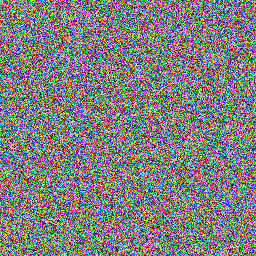 |
Random saturated RGB colors | Moderate-High | Very high | High—chaotic detail |
Key Insight: In Image A, despite zero luminance contrast, the chromatic contrast makes the boundary highly visible. This demonstrates why color-aware contrast metrics are essential for understanding visual salience and image quality.
Color Contrast in Different Color Spaces
RGB Space: Simple but Non-Uniform
Computing contrast directly in RGB is straightforward but problematic:
\[C_{RGB} = \sqrt{\sigma_R^2 + \sigma_G^2 + \sigma_B^2}\]Problems:
- Not perceptually uniform: A change of 10 units in blue is perceived differently than 10 units in green
- Device-dependent: RGB values change with display calibration
- Luminance not separated: Can’t distinguish brightness from color changes
HSV/HSL: Intuitive but Non-Perceptual
HSV (Hue, Saturation, Value) and HSL (Hue, Saturation, Lightness) are more intuitive for humans but still not perceptually uniform.
Hue contrast can be problematic:
- Hue wraps around (0° = 360°), making distance metrics tricky
- Perceptual hue differences aren’t uniform (we’re more sensitive to yellow-green differences than blue-purple)
Saturation contrast:
- Depends on lightness—saturated dark blue is hard to see
- Not perceptually uniform across hues
LCh: Cylindrical Lab
LCh transforms Lab into cylindrical coordinates:
- L: Lightness (same as Lab)
- C (Chroma): $C = \sqrt{a^{2} + b^{2}}$ (colorfulness)
- h (Hue): $h = \arctan2(b^, a^)$ (hue angle)
Advantages:
- Perceptually uniform (inherits from Lab)
- Intuitive—separates colorfulness from hue
- Better for comparing colors with similar lightness but different saturation
Applications in Computer Vision and Design
1. Web Accessibility (WCAG)
The WCAG defines contrast ratios for text legibility:
\[\text{Contrast Ratio} = \frac{L_{lighter} + 0.05}{L_{darker} + 0.05}\]where $L$ is relative luminance. Requirements:
- Normal text: Minimum 4.5:1
- Large text: Minimum 3:1
- Enhanced (AAA): 7:1 for normal text
Limitation: This is luminance-only and doesn’t account for chromatic contrast. Red text on green background can pass WCAG but still be problematic for colorblind users.
def wcag_contrast_ratio(rgb1, rgb2):
    """Calculate WCAG contrast ratio between two RGB colors."""
    def relative_luminance(rgb):
        # Normalize to 0-1 and apply gamma correction
        rgb_norm = rgb / 255.0
        rgb_linear = np.where(rgb_norm <= 0.03928,
                              rgb_norm / 12.92,
                              ((rgb_norm + 0.055) / 1.055) ** 2.4)
        # Compute relative luminance
        return 0.2126 * rgb_linear[0] + 0.7152 * rgb_linear[1] + 0.0722 * rgb_linear[2]

    L1 = relative_luminance(rgb1)
    L2 = relative_luminance(rgb2)

    L_max = max(L1, L2)
    L_min = min(L1, L2)

    return (L_max + 0.05) / (L_min + 0.05)

# Example: Black text on white background
black = np.array([0, 0, 0])
white = np.array([255, 255, 255])
print(f"Black on white: {wcag_contrast_ratio(black, white):.1f}:1")  # Should be 21:1

# Example: Red on green (isoluminant)
red = np.array([255, 0, 0])
green = np.array([0, 131, 0])
print(f"Red on green: {wcag_contrast_ratio(red, green):.1f}:1")  # Low ratio!
2. Saliency Detection
Color contrast is a key feature in visual saliency models. Regions with high chromatic contrast attract attention even without luminance contrast.
Itti-Koch saliency model uses color opponent channels:
- Red-Green (RG) contrast: $\text{RG} = R - G$
- Blue-Yellow (BY) contrast: $\text{BY} = B - \frac{R + G}{2}$
Combined with multi-scale processing, this predicts where humans look in images.
3. Color Constancy and White Balance
Understanding color contrast is crucial for white balance algorithms. The goal is to maintain chromatic contrast ratios across different illuminants.
Gray World Assumption:
- Average color in natural scenes is achromatic (gray)
- Adjust image so mean RGB = (128, 128, 128)
Limitation: Fails for scenes dominated by a single color
Von Kries Chromatic Adaptation:
- Scale each RGB channel independently
- Preserves chromatic contrast ratios better
4. Image Quality Assessment
Color contrast features are used in no-reference quality metrics:
S-CIELAB extends CIELAB with spatial filtering to model contrast sensitivity:
- Convert RGB to LMS (cone responses)
- Apply opponent color transforms
- Filter each channel with CSF-matched kernels
- Compute ΔE in this filtered space
This correlates better with perceived image quality than simple Lab distance.
5. HDR Tone Mapping
Tone mapping algorithms must preserve both luminance and chromatic contrast when compressing high dynamic range to standard displays.
Mantiuk et al. (2006) approach:
- Compute local contrast in luminance and chromatic channels
- Preserve contrast ratios while compressing global range
- Prevents color saturation loss in bright/dark regions
6. Image Segmentation
Color contrast drives many segmentation algorithms:
Graph-based segmentation:
- Nodes = pixels
- Edge weights = color distance in Lab space
- Segment where color contrast (edge weight) is high relative to within-segment variation
GrabCut uses color contrast to distinguish foreground/background:
- Gaussian Mixture Models in RGB space
- Iteratively refine based on color similarity
Color Contrast for Colorblind Users
Approximately 8% of males and 0.4% of females have some form of color vision deficiency. Designing for accessibility requires understanding how different types affect contrast perception:
Types of Color Blindness
- Deuteranomaly (most common): Reduced sensitivity to green
- Protanomaly: Reduced sensitivity to red
- Tritanomaly (rare): Reduced sensitivity to blue
- Monochromacy (very rare): No color vision
Design Guidelines
- Don’t rely on color alone: Use luminance contrast + patterns/symbols
- Avoid red-green combinations: Especially problematic for deuteranomaly/protanomaly
- Use blue-orange: Generally safe across color vision types
- Simulate: Use tools like Coblis or Photoshop’s color blindness preview
Example: Traffic Light Accessibility
Traffic lights use position (top/middle/bottom) and color because:
- Red-green colorblind users can’t distinguish hue
- But they can see luminance difference (red is darker than green)
- Position provides redundant cue
Choosing the Right Color Contrast Metric
| Metric | Best For | Limitations |
|---|---|---|
| Luminance-only (RMS, Michelson) | Grayscale approximation, legacy compatibility | Completely misses chromatic contrast |
| ΔE (Lab distance) | Perceptual color difference, quality assessment | Global metric, doesn’t capture spatial structure |
| WCAG Contrast Ratio | Text legibility, web accessibility | Luminance-only, fails for isoluminant colors |
| LCh Chroma Contrast | Comparing colorfulness, saturation effects | Less intuitive than ΔE for overall difference |
| Local Chromatic Contrast | Saliency detection, texture analysis | Computationally expensive, window-size dependent |
| Opponent Channel Contrast | Bio-inspired models, attention prediction | Requires opponent space transform, less standard |
Implementation Tips
1. Always Work in Perceptual Spaces for Color
Convert to Lab or LCh before computing contrast. RGB/HSV distances don’t correspond to perception.
# BAD: Euclidean distance in RGB
distance_rgb = np.sqrt(np.sum((color1 - color2)**2))

# GOOD: Delta E in Lab
lab1 = cv2.cvtColor(color1.reshape(1,1,3), cv2.COLOR_RGB2Lab)[0,0]
lab2 = cv2.cvtColor(color2.reshape(1,1,3), cv2.COLOR_RGB2Lab)[0,0]
delta_e = np.sqrt(np.sum((lab1 - lab2)**2))
2. Consider Both Luminance and Chromatic Contrast
For comprehensive analysis, compute both:
def comprehensive_color_contrast(image_rgb):
    """Compute both luminance and chromatic contrast."""
    # Convert to Lab
    lab = rgb_to_lab(image_rgb)
    L, a, b = lab[..., 0], lab[..., 1], lab[..., 2]

    # Luminance contrast
    luminance_contrast = np.std(L) / (np.mean(L) + 1e-10)

    # Chromatic contrast
    chroma = np.sqrt(a**2 + b**2)
    chromatic_contrast = np.std(chroma) / (np.mean(chroma) + 1e-10)

    return {
        'luminance_contrast': luminance_contrast,
        'chromatic_contrast': chromatic_contrast,
        'total_contrast': np.sqrt(luminance_contrast**2 + chromatic_contrast**2)
    }
3. Handle Edge Cases
- Achromatic images: Chromatic contrast is undefined/zero
- Very dark images: Lab conversion can be unstable
- Out-of-gamut colors: Lab to RGB conversion may clip
4. Validate with Human Perception Studies
When in doubt, run user studies. Perceptual uniformity of Lab is approximate—individual differences matter, especially for subtle color differences.
Color Contrast in Different Domains
Photography and Imaging
- Exposure bracketing: Preserve color contrast in highlights and shadows
- Color grading: Enhance chromatic contrast for mood (e.g., teal-orange Hollywood look)
- Noise reduction: Preserve chromatic edges while smoothing luminance noise
Medical Imaging
- Histopathology: Stains create chromatic contrast (H&E: pink vs. purple)
- Fluorescence microscopy: Multiple fluorophores with distinct hues
- Thermal imaging: False color maps add chromatic contrast to temperature data
Remote Sensing
- Multispectral imaging: Bands beyond visible spectrum mapped to RGB
- Vegetation indices: NDVI uses NIR-Red contrast
- Change detection: Chromatic differences indicate material changes
Conclusion: Color Contrast Is Multi-Dimensional
Unlike grayscale images where contrast boils down to brightness differences, color images require us to think in multiple dimensions:
- Luminance: How bright is it?
- Chrominance: What color is it and how saturated?
- Spatial structure: How do these properties vary across the image?
Understanding color contrast means:
- Recognizing that isoluminant colors can have high perceptual contrast
- Using perceptually uniform color spaces (Lab, LCh) for meaningful measurements
- Considering both luminance and chromatic components in quality assessment
- Designing for accessibility by not relying on chromatic contrast alone
- Leveraging opponent color channels for bio-inspired algorithms
The next time you design a user interface, analyze an image, or build a computer vision algorithm, ask yourself: am I considering both dimensions of color contrast? The answer often makes the difference between a system that merely works and one that truly sees the way humans do.
Further Reading
- Fairchild, M. D. (2013). Color Appearance Models. John Wiley & Sons.
- Wyszecki, G., & Stiles, W. S. (2000). Color Science: Concepts and Methods, Quantitative Data and Formulae. Wiley.
- Gegenfurtner, K. R., & Sharpe, L. T. (1999). Color Vision: From Genes to Perception. Cambridge University Press.
- Mantiuk, R. et al. (2006). “Perceptual framework for contrast processing of high dynamic range images.” ACM TOG, 25(2), 286-308.
- W3C Web Accessibility Initiative: WCAG 2.1 Guidelines
How do you handle color contrast in your projects? Do you have experiences where chromatic contrast made a critical difference? I’d love to hear your insights—share them in the comments or reach out!